China Shines: Insights into Culture and Society
Explore the vibrant narratives and emerging trends from China.
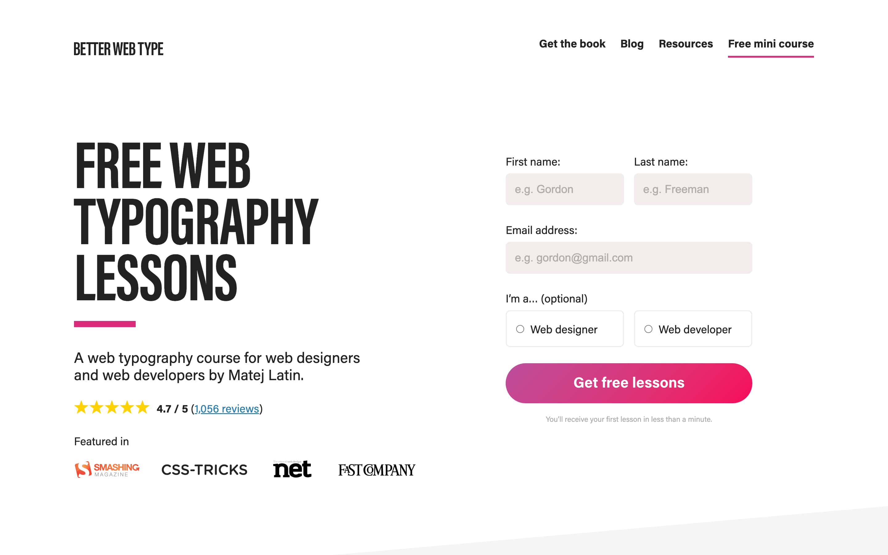
Type Right, Click Bright: Elevate Your Web Design with Typography
Transform your web design game! Discover how typography can elevate your site and captivate your audience instantly. Click to learn more!
The Impact of Typography on User Experience: Why It Matters
Typography plays a critical role in shaping the user experience on websites and applications. It is not merely about choosing aesthetically pleasing fonts; rather, it involves creating a seamless flow of information that enhances readability and overall engagement. When users encounter well-chosen fonts and proper spacing, they are more likely to absorb the content, leading to lower bounce rates and increased time on site. For instance, typography that employs hierarchy through variations in size, weight, and style can guide users effortlessly through complex information, making it easier to digest key points.
Moreover, inconsistent typography can lead to confusion and frustration, detracting from the user’s experience. Websites that fail to maintain a cohesive visual language risk appearing unprofessional. Key elements such as line height, letter spacing, and contrast are crucial in ensuring that text is legible across different devices and screen sizes. In summary, the impact of typography extends beyond appearances; it fundamentally affects how users interact with content and their overall satisfaction. Thus, investing in thoughtful typography is essential for creating a positive and memorable user experience.

10 Typography Tips to Enhance Your Web Design
Typography plays a crucial role in web design, influencing how users perceive and interact with your content. Here are 10 typography tips to enhance your web design:
- Choose Readable Fonts: Select fonts that are easy to read on screens. Sans-serif fonts like Arial and Helvetica are popular for their clean appearance.
- Limit Font Styles: Use a maximum of three different font styles to maintain a cohesive look.
- Pay Attention to Hierarchy: Use size and weight to create a visual hierarchy, establishing which elements are most important.
- Focus on Line Height: Proper line height makes text easier to read; aim for 1.5 times the font size.
- Contrast is Key: Ensure there’s enough contrast between the text and background to improve readability.
Additionally, consider these remaining tips to elevate your typography:
- Limit Text Width: Keep line length between 50-75 characters for optimal readability.
- Utilize White Space: Embrace white space for a clean layout, allowing text to breathe.
- Responsive Typography: Adapt your typography for various devices; ensure it looks good on both desktop and mobile.
- Test Your Typography: Conduct user testing to see how your audience interacts with your typography choices.
- Stay Updated: Keep an eye on typography trends to ensure your design remains fresh and modern.
How to Choose the Right Fonts for Your Website: A Comprehensive Guide
Choosing the right fonts for your website is crucial for creating a visually appealing and effective user experience. Font choice can significantly impact readability, brand perception, and overall aesthetics. Begin by considering the purpose of your website and your target audience. For instance, a corporate site may benefit from clean, professional fonts like Helvetica or Arial, while a creative portfolio might leverage more artistic fonts, such as Georgia or Montserrat. Additionally, ensure that the font you choose is web-safe or part of a web font service, guaranteeing consistent display across all devices.
Once you've narrowed down your font options, evaluate them based on readability and legibility. Test your fonts in various sizes and configurations to see how they perform. Consider establishing a font hierarchy by using different font weights or styles for headings, subheadings, and body text. This can enhance the visual flow and guide users naturally through your content. Finally, don't forget to consider color contrast and background pairing, as these can further influence how your text is perceived. By taking these elements into account, you'll be well on your way to selecting the perfect fonts for your website.